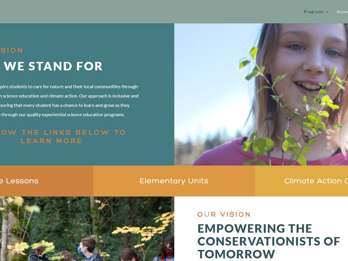

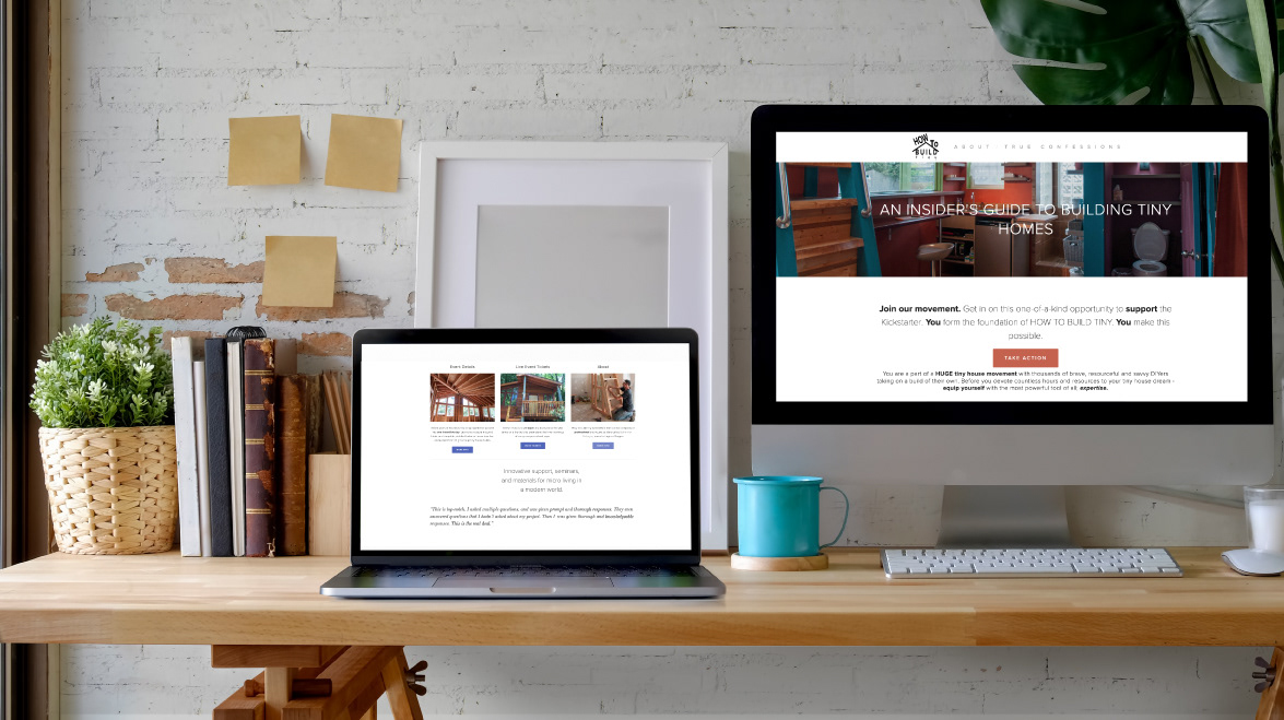
Over the past several years, I have collaborated on and built design for numerous websites. This is a brief collection of highlights. Please follow the links below projects to view the full sites.
While I worked at Arcimoto, in addition to designing vehicles, I was tasked with contributing design revisions to the early versions of their website, digital dashboard and rental app. This was a particularly exciting challenge because our product was constantly evolving and the designs had to adjust to keep up with new features and business plans.
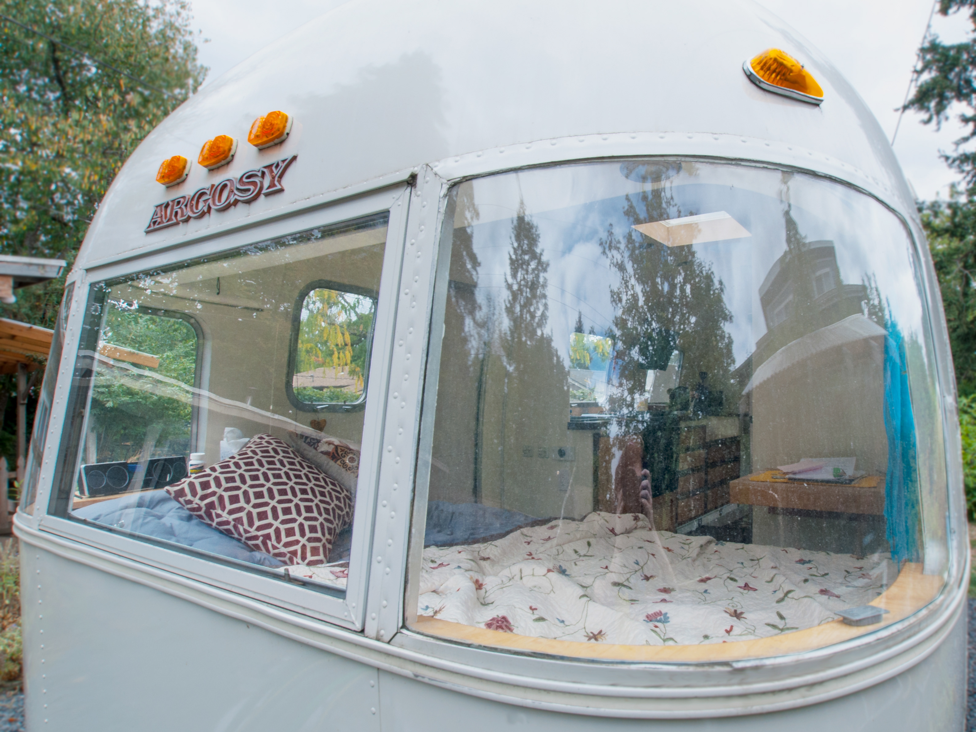
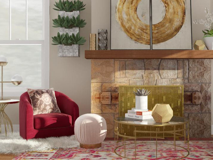
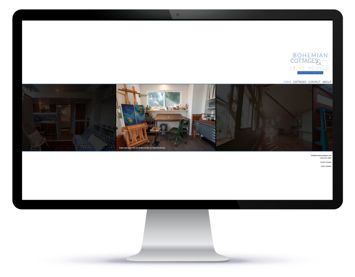
The same owner ran these businesses (MOD eugene for handcrafted furniture and Bohemian Cottages for custom tiny homes), so it was important that they felt like sister sites to returning customers. I developed the logos, copy, photo library and 3D render library in order to rebrand his business lines.
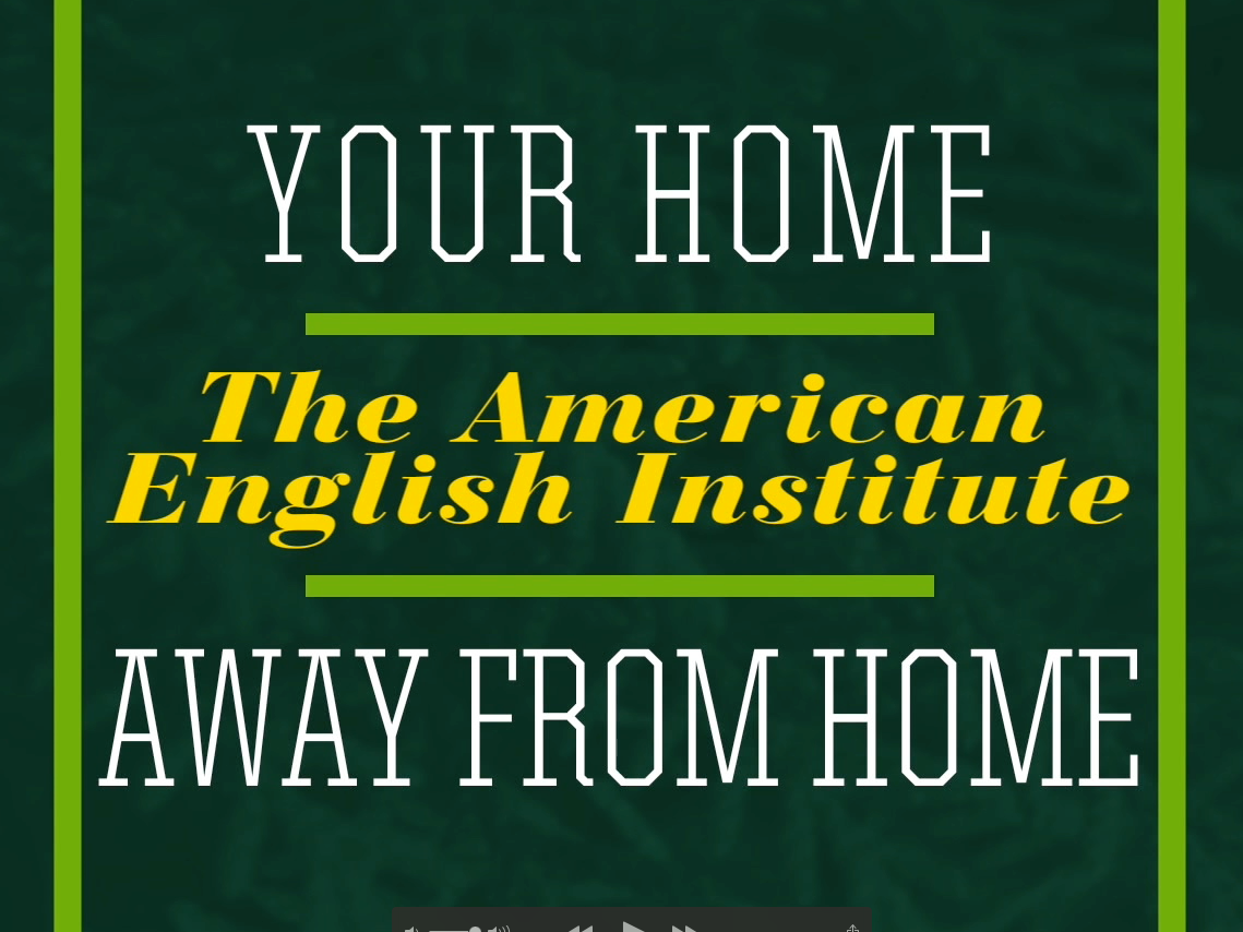
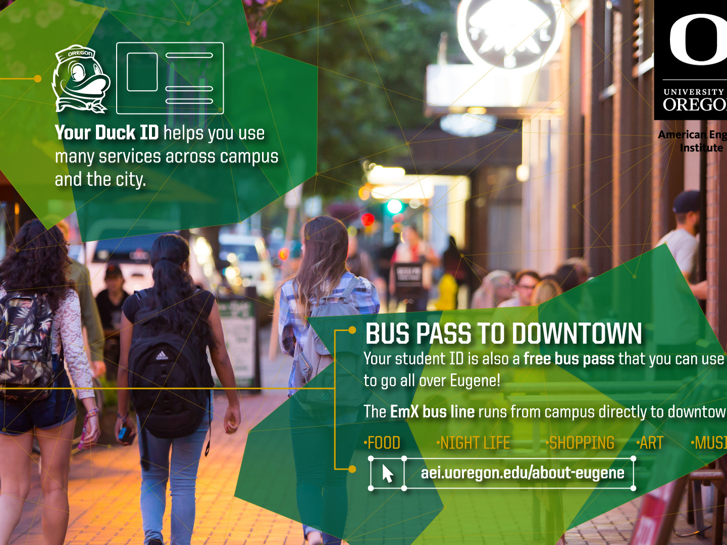
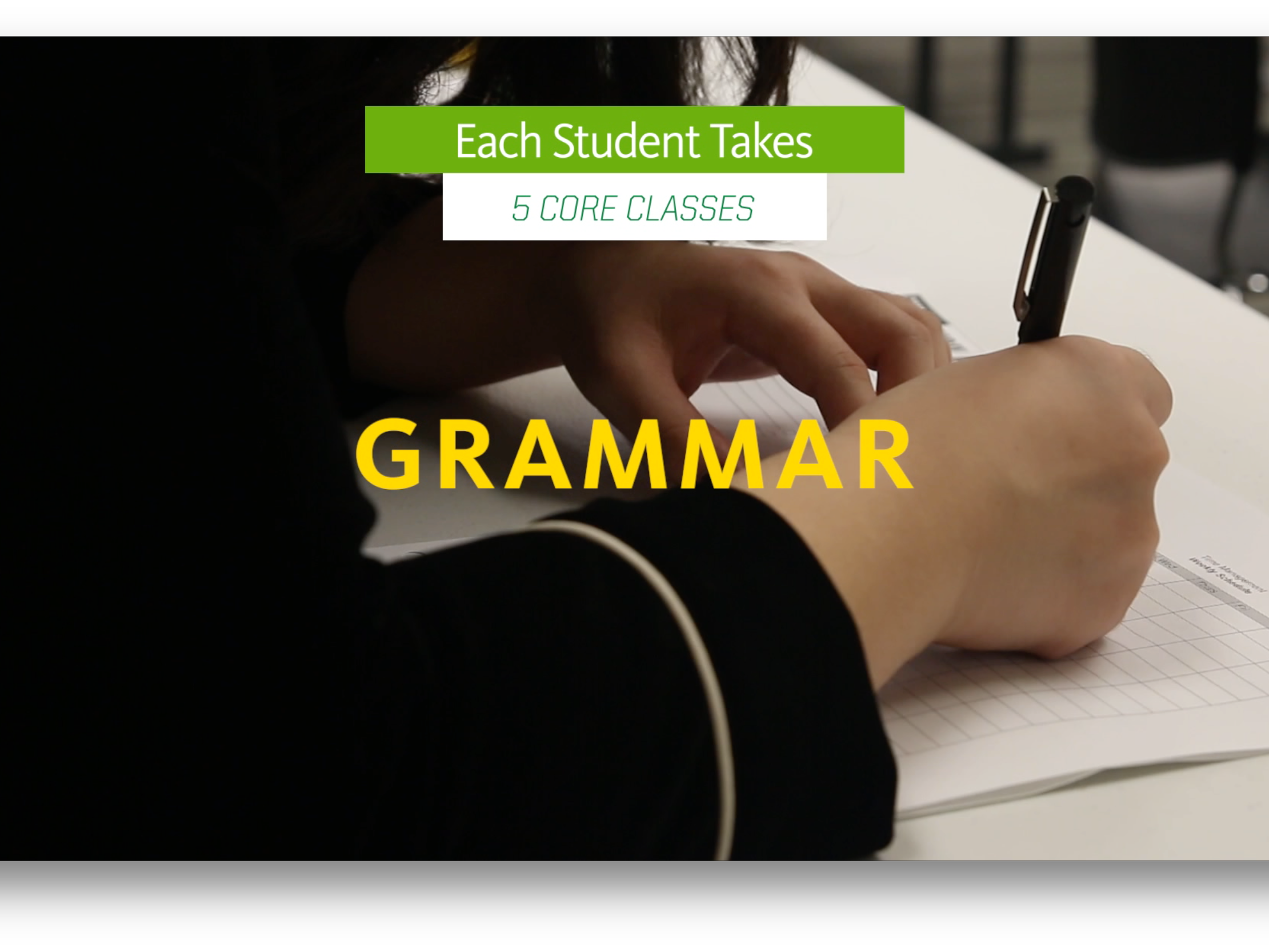
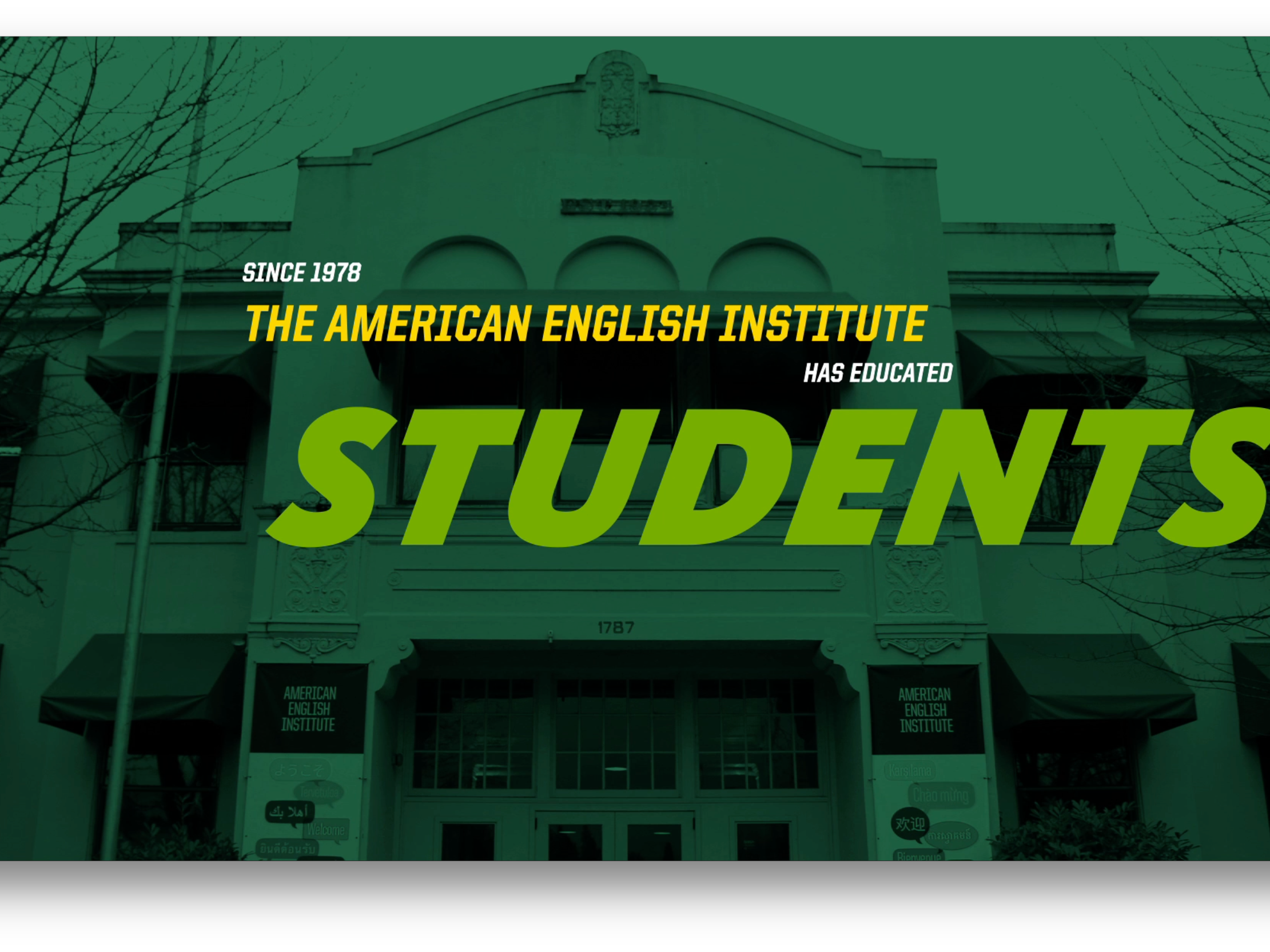
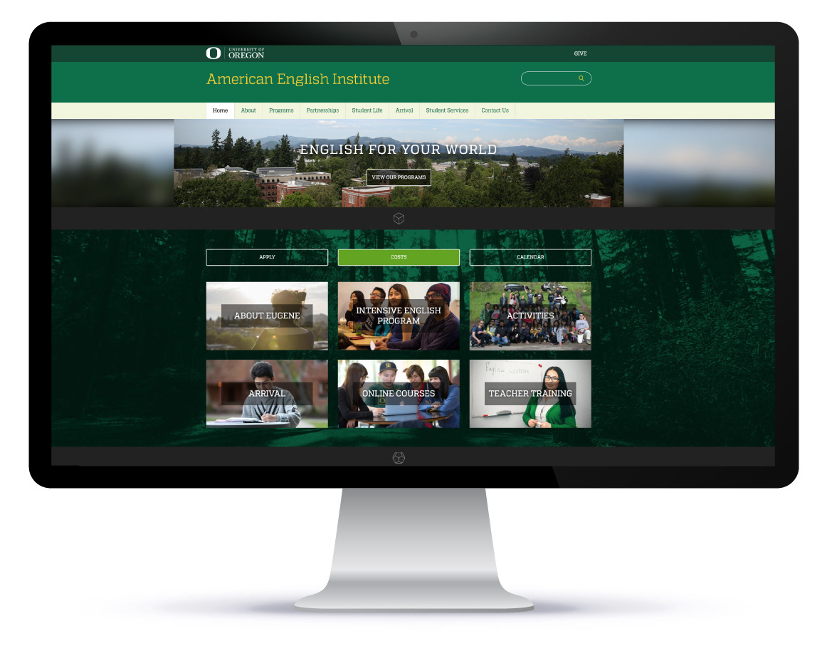
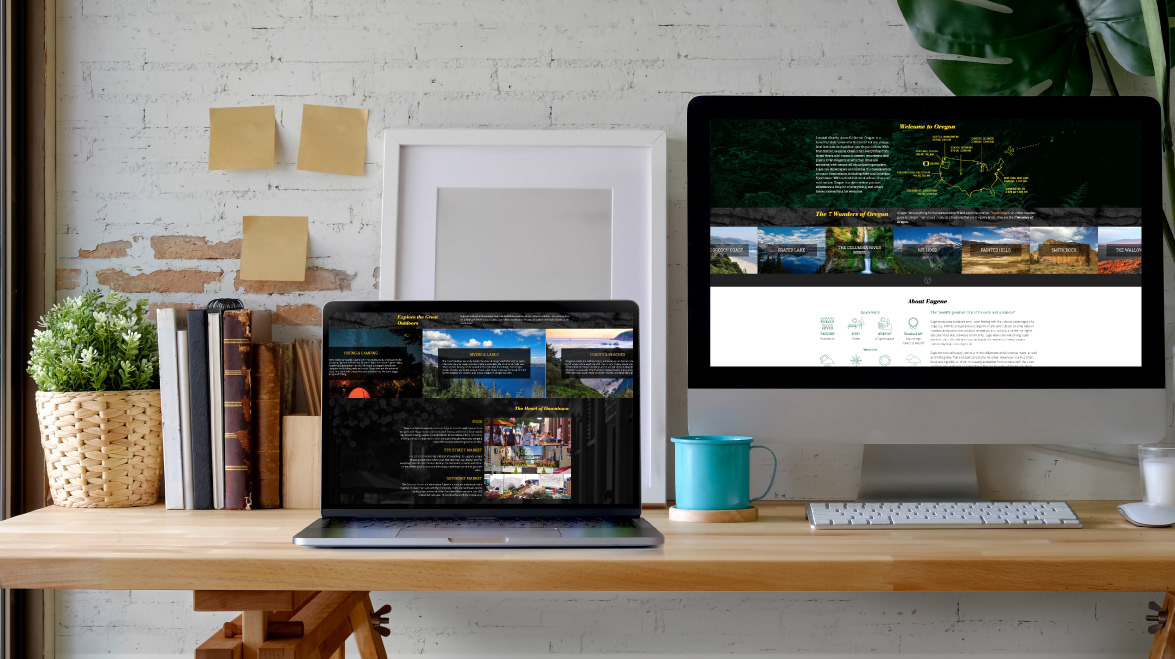
A particularly fun challenge was rolling out a brand new website for the American English Institute at the University of Oregon. It needed to align with new branding criteria, but was also an opportunity for us to redesign the experience to lean more on interactive, visual elements and icons for the young, non-English-speaking audience we wanted to engage.
This site, How to Build Tiny, was dedicated to seminars, blog posts, and teaching events about DIY tiny house building located around the country. I developed the logo, copy, layout, and executed an accompanying fundraiser campaign when this brand was launched.
